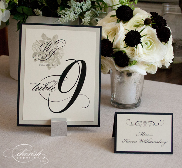
These table numbers are so elegant and simple. I love how the bride chose to put the couple’s monogram in the top left corner along with the date of the wedding above the table number. It tied in perfectly with the invitations and programs. And the use of a glyph on the place card instead of just having names just adds to the simple elegance.

